Designing a simpler, automated Self Assessment registration service for HMRC
Overview
HMRC’s existing Self Assessment registration journeys were built around legacy forms, organisational processes and separate routes for different user groups. They were difficult to understand, inaccessible by modern standards, and often resulted in manual processing, rejection or long waits for a Unique Taxpayer Reference.
I joined the programme as the Content Designer and increasingly took responsibility for shaping the service itself. As the work developed, I became the main point of design contact across the team and was later asked to take on the Service Designer role while retaining ownership of the content.
My role became to understand the existing service end to end, simplify the user journey, work within significant technical and policy constraints, and help create a modern GOV.UK service that could support automation at scale.
Role: Principal Content Designer → Service Designer
Organisation: HMRC, through consultancy
Service: Register for Self Assessment
Stage: Public beta (circa 120,000 submissions so far)
Users: Individuals registering for Self Assessment, including self-employed sole traders and people registering for non-self-employed reasons
Scale: 12 million currently in Self Assessment. Service serves circa 640k new registrations per year.
The problem
The existing registration experience consisted largely of legacy “shortforms”: long, single-page forms with unclear language and accessibility problems.
Different users were sent to different forms depending on whether they were self-employed or registering for another reason. HMRC also treated people returning to Self Assessment as a separate process called “reinstatement”.
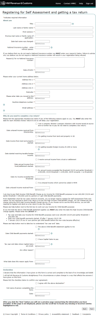
Personal details, eligibility questions and declarations were presented on a single long page.
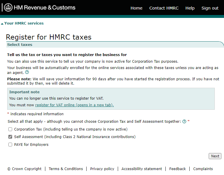
Self-employed users entered through a separate journey and had to select the relevant HMRC tax registration route.
These routes show the starting point for the redesign. Users had to navigate HMRC’s service structure and decide which route applied to them before the service could gather the information it actually needed.
Behind the forms, registrations could require manual processing. Users could wait weeks for a UTR, potentially putting them at risk of missing filing deadlines. Registrations could also be rejected after submission because of issues such as address mismatches or information being entered in a format HMRC could not process.
The challenge was not simply to digitise those forms.
We needed to design a service that could prevent problems before submission, support greater automation, meet GOV.UK standards and still work with HMRC’s existing legacy systems.
My role & taking ownership of the service
I originally joined as the Content Designer on the first team working on the programme.
Under pressure to produce an early proof of concept, I proposed concentrating first on changes we could make quickly: using established GOV.UK patterns, improving accessibility, simplifying questions and removing unnecessary complexity.
That meant I could start working directly with the Interaction Designer before a full service-design model had been produced.
As the work progressed, I began leading design discussions and prototype demonstrations. I also created top-down Mural journeys showing the interface alongside important backend interactions, which helped me build a much deeper understanding of the service.
When the original Service Designer left, I was asked to take over the role because of the service knowledge and design leadership I had developed.
I chose to retain content ownership as well, creating a combined service and content-design role.
That has allowed me to move rapidly between identifying the service logic, drafting the journey and content, prototyping ideas, testing them and working with developers and stakeholders to make them viable.
“You have repeatedly demonstrated your capability to deliver… This has enabled me to develop absolute trust in your capability.”
Matthew Kennedy, Product Owner, HMRC
Understanding the whole service
I mapped the existing self-employed and non-self-employed journeys separately before creating a future-state service blueprint that brought them together.
The blueprint connected the user-facing journey to data, technology, identity checks, risking, record creation, UTR generation and post-submission communications. It also captured user needs, known pain points, routes that remained out of scope and the impact of backstage processes on the experience above the line of visibility.
I also mapped the wider ecosystem around the transaction: GOV.UK guidance, agent journeys, offline registration and caseworker activity, support channels and outbound communications.
The blueprint is primarily a working design asset for the team rather than a stakeholder presentation. It has also been used by standards and assurance teams as evidence that the team understands the service end to end, and by other teams to understand dependencies and how our work might affect or enable their own services.
I mapped the existing self-employed and non-self-employed journeys separately before creating a future-state service blueprint that brought them together.
The blueprint connected the user-facing journey to data, technology, identity checks, risking, record creation, UTR generation and post-submission communications. It also captured user needs, known pain points, routes that remained out of scope and the impact of backstage processes on the experience above the line of visibility.
I also mapped the wider ecosystem around the transaction: GOV.UK guidance, agent journeys, offline registration and caseworker activity, support channels and outbound communications.
The blueprint is primarily a working design asset for the team rather than a stakeholder presentation. It has also been used by standards and assurance teams as evidence that the team understands the service end to end, and by other teams to understand dependencies and how our work might affect or enable their own services.

Designing around users rather than HMRC structures
One of the biggest changes was combining the self-employed and non-self-employed registration journeys into one service.
Instead of expecting users to understand which HMRC form or registration route applied to them, the service asks a simple question: do you work for yourself?
Their responses determines which internal branch and relevant set of questions they’re then asked. To the user, it is one service.
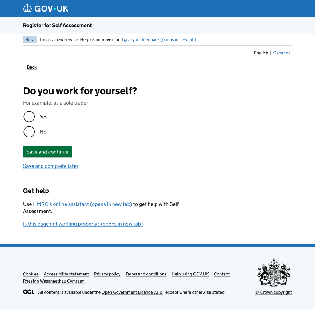
I applied the same principle to “reinstatement”, HMRC’s term for someone returning to Self Assessment after previously having a UTR.
I identified that having an existing UTR mattered to HMRC’s processing, but did not need to be a separate concept for the user. From their perspective, they were either currently in Self Assessment or they were not. If they were out, they needed to register.
By absorbing reinstatement into registration, we removed another internal HMRC concept from the user journey and reduced the amount of guidance users needed to interpret before starting.
Removing unnecessary decisions
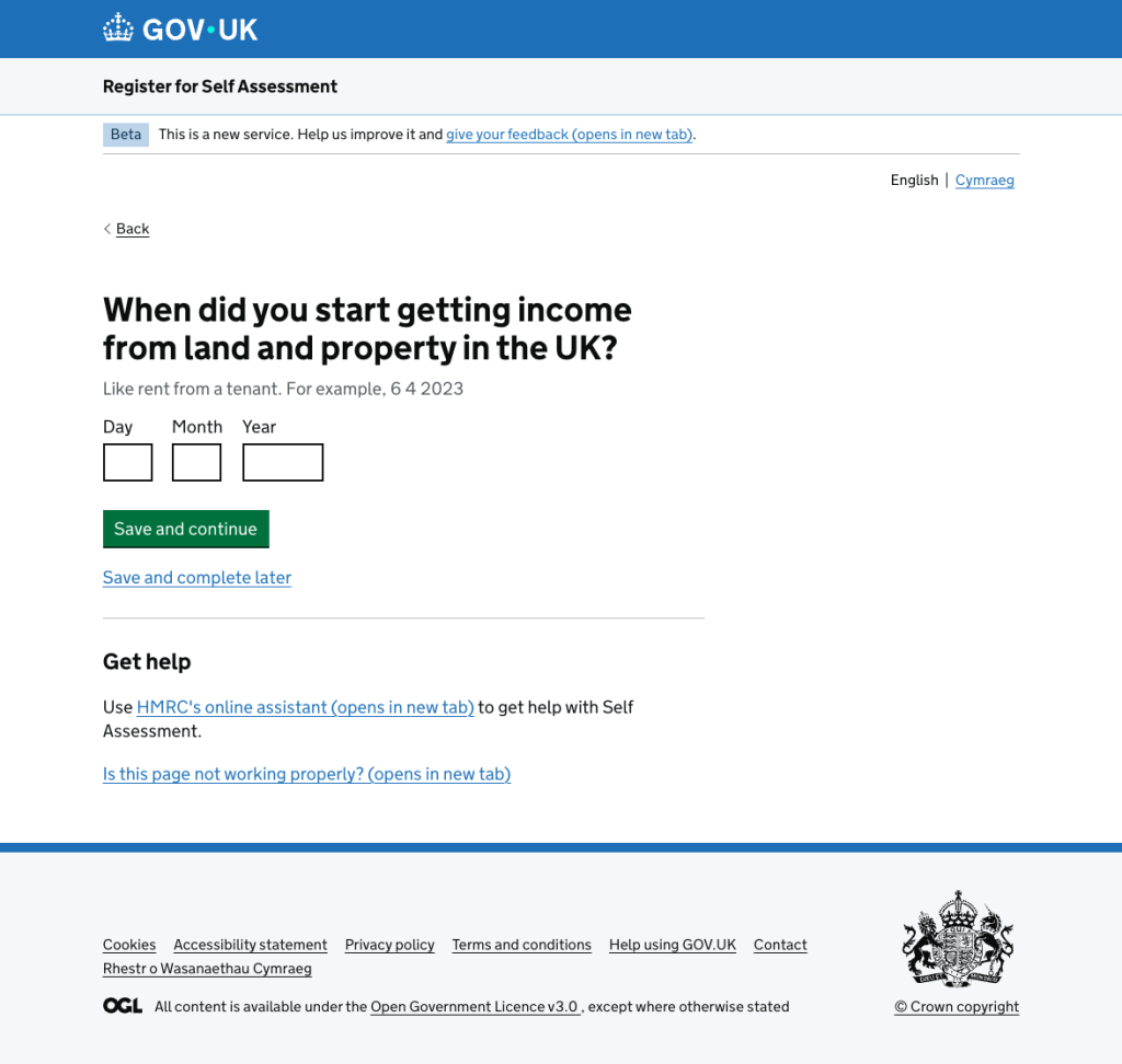
The legacy journey also asked users to make decisions they had already made elsewhere.
For example, existing registration forms included income thresholds within questions about why somebody needed to register.
But users typically reach the service after using GOV.UK guidance and eligibility tools that already establish whether those thresholds apply.
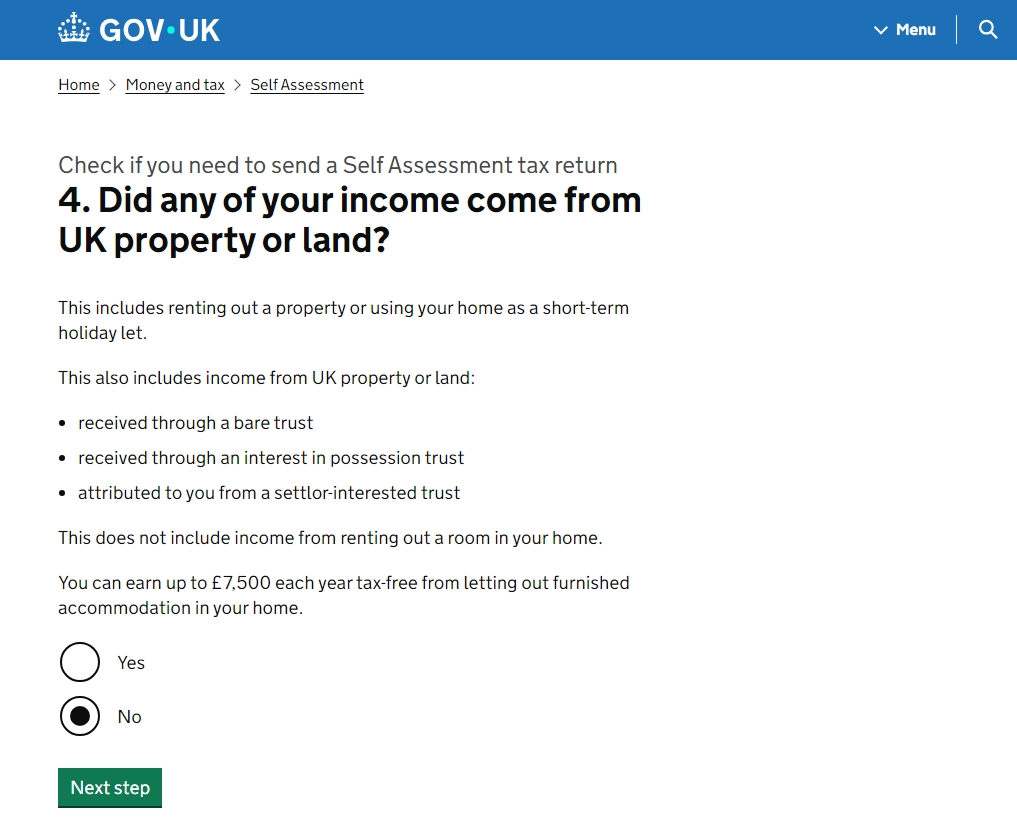
Repeating them inside registration meant asking the user to consider two things at once: the type of income they had and whether they had crossed the relevant threshold.
I simplified those questions so the service concentrated on the information it actually needed at that point: what kind of income or circumstance was causing them to register?
This reflects a broader principle in my content practice: simplify aggressively first, then add complexity back only where policy, evidence or service requirements demonstrate that it is necessary.
Designing out problems
A recurring design goal was to prevent users from completing a journey successfully only to have their registration rejected later.
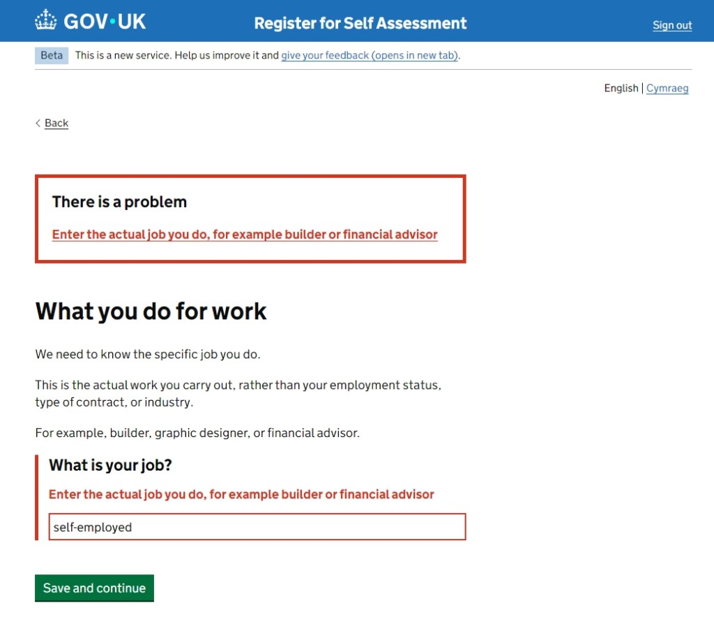
One example came from conversations with HMRC caseworkers. They regularly saw registrations fail because users entered descriptions such as “contractor” or “self-employed” when HMRC required an actual profession or trade.
I worked with process owners to understand the common problematic entries, then designed a two-stage intervention.
First, the page explains in plain English what kind of answer HMRC needs, so the user has the opportunity to self-serve before making an error. If they still enter a known problematic response, validation prevents them from continuing and explains what they need to change.
This moved the intervention upstream: instead of allowing an avoidable error to become a rejected registration that somebody had to resolve later, the service helps the user correct it at the point of entry.
Working with legacy technology rather than reproducing constraints
One of the main constraints was that the new service could not freely redesign the backend. Data still had to map to fields expected by existing interfaces and systems.
A good example was contact information. The legacy self-employment registration collected general contact details and then separately requested “business contact details”. Once the journey moved from a long form to one question per page, user research made the duplication even more obvious: people questioned why they were being asked for another email address or phone number when they had already provided one.
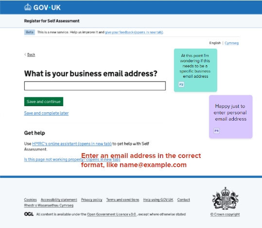
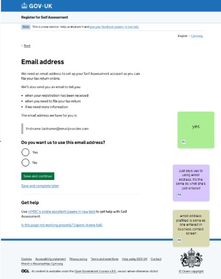
The backend still expected data in existing business-contact fields, and the risking team initially objected to removing them because telephone information fed downstream checks.
I worked with developers to establish that the general contact information could be mapped into the existing fields. I then clarified the proposal for the risking team: rather than reducing the data available, the new service would provide both an email address and telephone number consistently, improving the completeness of the data they received.
“I’ve lost count of the amount of times where we’ve been grappling with a complex problem and have had Andy come along and propose a simple, elegant solution to resolve it.”
Phil Addis · Senior Process Officer, HMRC
The risking team agreed to the approach on the condition that both email and phone were mandatory. The duplicate business-contact screens were subsequently removed, leaving one set of contact details, and no concerns have been raised by users or the risking function since.
This is typical of how I work with genuine constraints: understand why the requirement exists, protect the underlying need, and redesign the user experience around it rather than treating the current implementation as fixed.
Pragmatic compromise
Not every problem could be solved in the ideal way immediately.
When we first expanded the service to include people who had previously been in Self Assessment, I wanted to introduce additional front-end questions so we could distinguish new registration from reactivation and tailor the confirmation accordingly.
Development effort meant that was not viable for the initial release. I accepted lifting the restriction without those additional screens, but revisited the existing confirmation content instead.
By changing the wording so it explained that users would receive a UTR only if they had not previously been in Self Assessment, we could make the confirmation accurate for both groups without introducing another interaction.
That gave us a lower-cost solution we could test before deciding whether the heavier front-end redesign was genuinely necessary.
Designing beyond the transaction
The service does not end when somebody submits a registration. I mapped the post-submission journey, including backend processing, risking, UTR creation and the communications users receive afterwards.
The service includes reassurance messaging confirming that HMRC has received the registration and explaining what happens next. This reduces uncertainty after submission and is intended to reduce avoidable contact from users checking whether their registration has been received.
[Image: SMS coms mapping]]
I also looked beyond the primary digital journey. Following a GOV.UK service assessment, we were challenged on how well we understood the caseworkers who would support users as the service moved towards public beta.
I worked with the Product Owner and other stakeholders on a series of sessions across HMRC offices, demonstrating the service to operational teams, answering questions and gathering feedback about problems they encountered in the existing process.
That work fed into business-readiness activity and directly informed design changes, including the profession-validation example above.
Leading through assurance
I led the design section of the GOV.UK service assessment.
I opened with a demonstration of the service and then led the design contribution during an extended assessor Q&A, using visual evidence from our Mural board to explain how the service met the relevant standards.
My contribution covered not just interface and content decisions, but service design, user research and the way we used performance evidence to iterate the service.
Assessment findings were then fed back into the service and our ways of working rather than treated as a one-off gateway exercise. The caseworker roadshow was one of the significant changes that followed that challenge.
Outcome
The redesigned service brings previously separate registration routes into one user-facing service, removes internal concepts such as reinstatement from the user’s decision-making, eliminates unnecessary questions and duplicate contact information, and introduces validation intended to prevent known causes of downstream rejection.
It also creates a stronger foundation for automation while continuing to work with HMRC’s legacy technical estate.
The service is now in public beta and has processed over 120,000 registrations as of September 2026. Self Assessment overall operates at significant scale, with around 12 million people currently in the system and approximately 640,000 new registrations a year.
Skills used
Service design: end-to-end service modelling, complex ecosystems, operational and technical dependencies, designing across channels.
Content design: simplification, plain English, question design, validation, guidance and reducing cognitive load.
Strategic design: reframing organisational processes around user needs and distinguishing genuine constraints from inherited complexity.
Leadership: taking ownership beyond the original role, facilitating decisions, leading assurance, and becoming a trusted design authority across the programme.
Delivery: balancing ideal-state design with legacy technology, time and stakeholder constraints while continuing to move the service forward.

 Andy Price