Government Equalities Office / Cabinet Office · Content design · Sensitive services · Policy and evidence
Overview
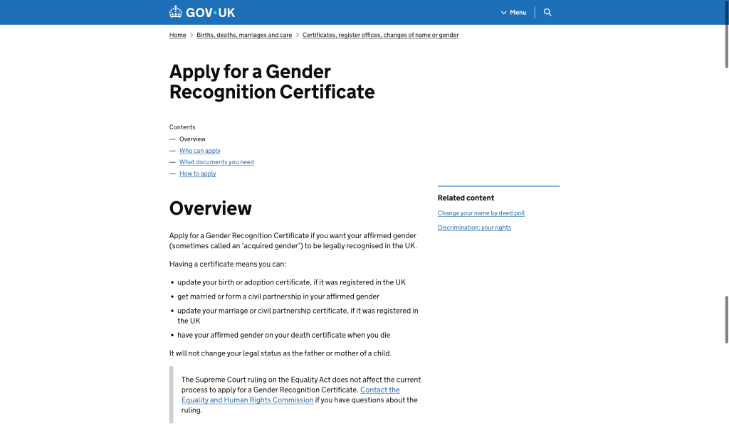
The Government Equalities Office needed to provide an online route for people applying for a Gender Recognition Certificate. The underlying policy was not being redesigned as part of the work, so the service still had to support an evidence-heavy process that could be time-consuming, sensitive and difficult for applicants to navigate.
I worked as the Content Designer on the service. My role was to make the application as clear, respectful and manageable as possible without changing the legal or policy requirements behind it.
That meant working closely with users, policy colleagues and medical professionals; designing content that could be understood by people with different language preferences and experiences; and finding better interaction patterns when guidance alone became too complex.
Role: Content Designer
Organisation: Government Equalities Office / Cabinet Office
Service: Apply for a Gender Recognition Certificate
Users: People applying for legal recognition of their acquired gender
Focus: Sensitive language, evidence requirements, guidance, save-and-return application design and a personalised document checker
The challenge
This was a difficult content-design environment because the normal instinct to simplify language had to be balanced with sensitivity, legal accuracy and the fact that applicants might describe themselves and their experiences in different ways.
The service also had to explain evidence requirements that were not always straightforward. GOV.UK content needs to be clear and definitive, but some evidence was ultimately reviewed with an element of professional or panel judgement. The content therefore had to give applicants enough certainty to act without pretending that every decision was completely mechanical.
Policy change was outside scope. The design task was not to remove the underlying requirements, but to reduce the avoidable burden created by the way they were explained and organised.
Designing sensitive language
Plain English was still essential, but it could not be applied mechanically. A term that looked simpler on paper could be inappropriate, imprecise or unfamiliar to the people using the service.
I used user research to understand the language applicants recognised and were comfortable with, while working with policy colleagues to make sure the service remained legally and procedurally accurate.
We also spoke to medical professionals because parts of the evidence journey connected applicants with clinicians and other professionals. The wording needed to create a straight line between what the applicant understood, what policy required and what the professional providing or reviewing evidence would recognise.
This meant treating terminology as part of the service design rather than as a final copy-editing step.
Making a demanding application manageable
The application required users to gather information and evidence over time. It was unrealistic to design it as a transaction that everybody would complete in a single sitting.
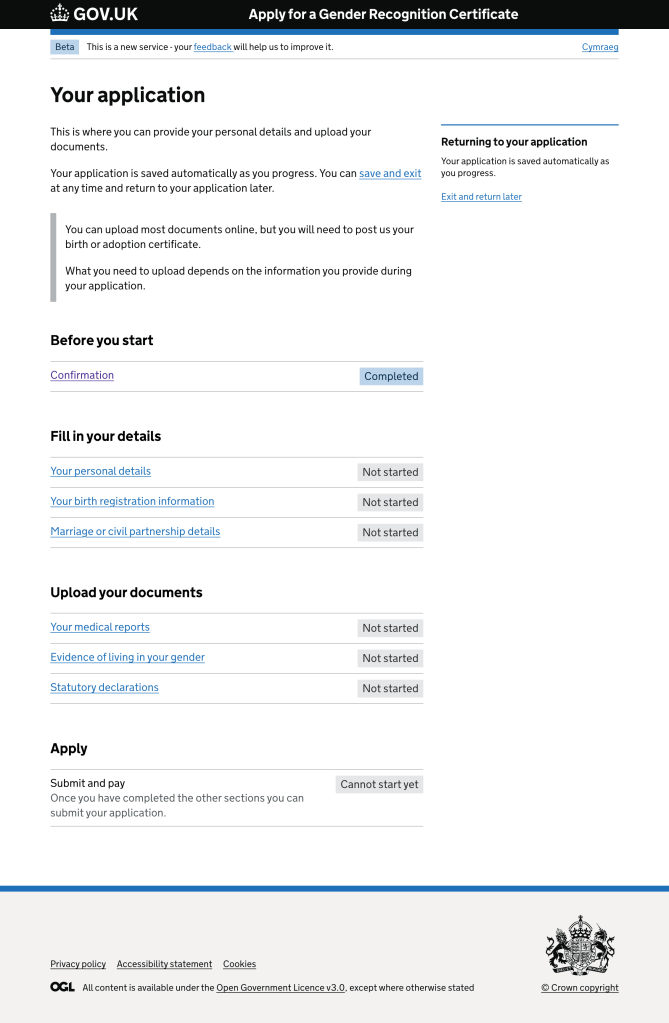
We used a section-based application pattern that showed applicants what they had completed and what was still outstanding, and allowed them to save their progress and return later.
That interaction acknowledged the reality of the task: applicants might need to find documents, contact other people or organisations, or take time before continuing. The service therefore supported progress over time rather than treating interruption as failure.
When guidance became the problem
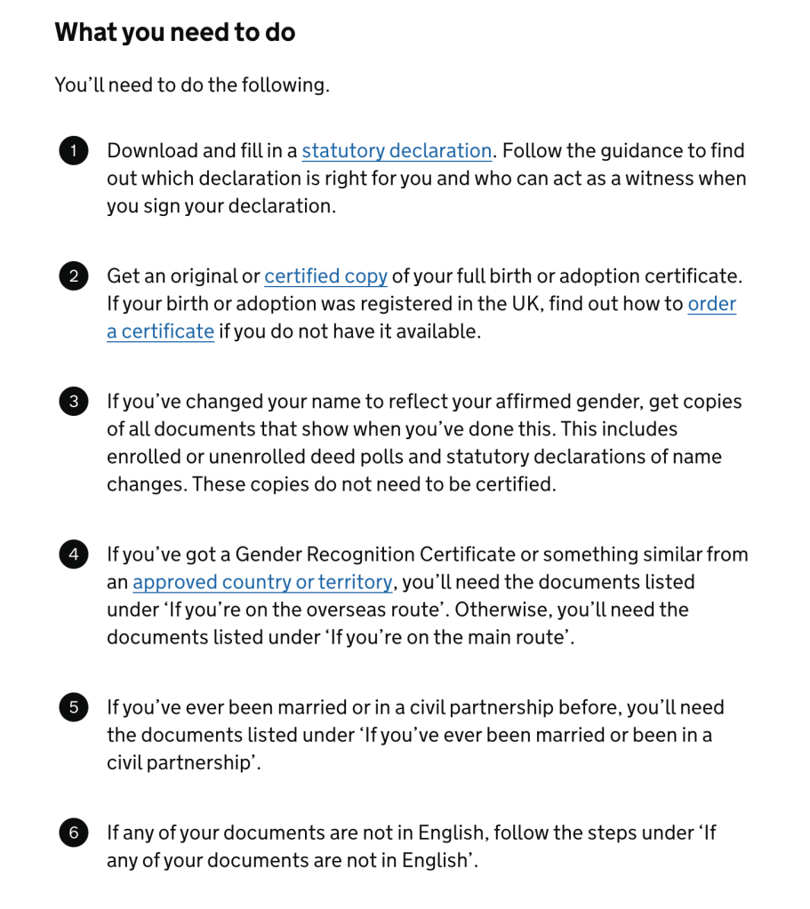
One of the clearest problems emerged while we were testing the GOV.UK guidance that explained which documents people needed for their application.
Different applicants needed different combinations of evidence. As we tried to describe every scenario accurately on one guidance page, the content became increasingly long and difficult to scan.
User research showed that this was overwhelming. Even when all the information was technically present, applicants still had to read a large amount of content, work out which conditions applied to them and translate that into their own personal list of documents.
I concluded that this was no longer primarily a writing problem. We needed a different interaction.
Turning complex guidance into a personalised checker
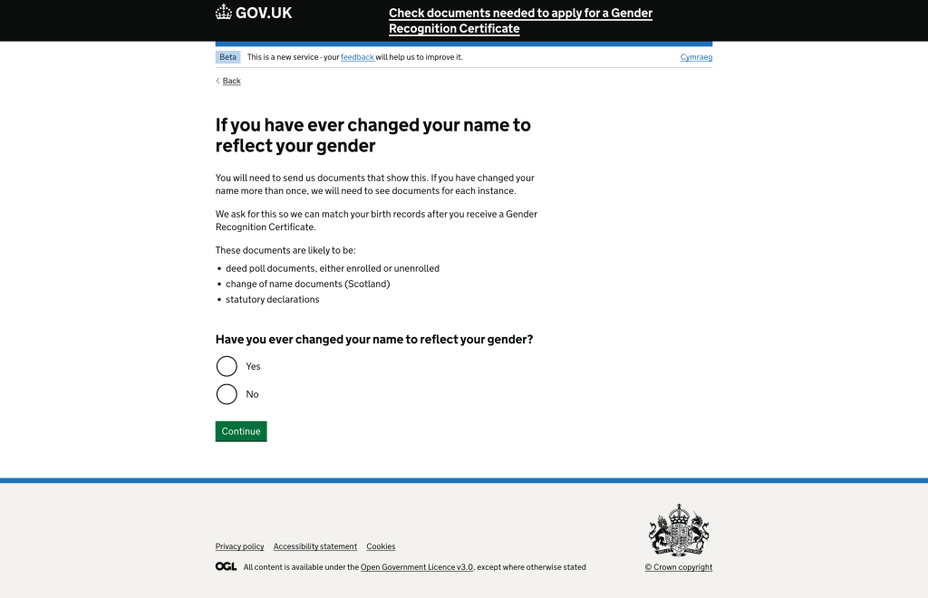
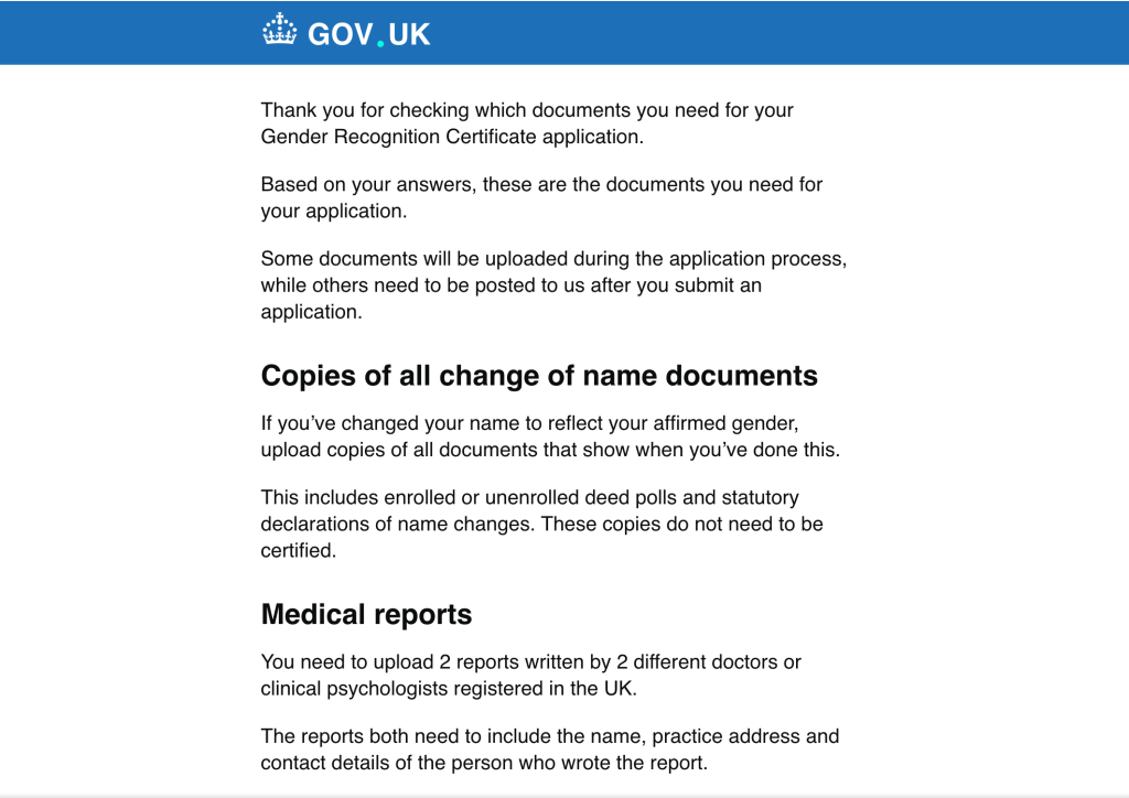
I proposed a document checker that would ask applicants a short series of questions about their circumstances and then generate the exact evidence list relevant to them.
Instead of reading every possible scenario and deciding what to ignore, users could answer questions once and let the service filter the guidance for them.
At the end, the checker produced a checklist that the applicant could use while gathering their documents. This turned a large body of conditional guidance into a practical task list tailored to an individual application.
Making personalisation safe
Personalising the guidance increased the importance of getting the logic right. If the checker failed to identify a required document, the user could submit an incomplete application and be negatively affected by the omission.
I worked closely with policy colleagues to check the possible scenarios, refine the questions and make sure the resulting document combinations were complete.
The work involved repeated checking and iteration. The goal was not simply to make the guidance feel easier; it had to remain reliable enough that applicants could trust the checklist as the basis for preparing an application.
What we learned from testing
Users found the checker much easier to manage than the long-form guidance because it reduced the amount of information they had to interpret themselves.
Testing also helped us refine the wording and logic, while policy review was essential for covering edge cases and making sure no required evidence disappeared as a consequence of simplification.
This reinforced an important principle in my content practice: sometimes the best way to simplify content is not to rewrite it again, but to change the way the service delivers it.
My contribution
Across the service, I was responsible for turning complex policy and evidence requirements into usable content and interactions.
That included working across user research, policy and professional stakeholders; shaping the language used in a sensitive service; structuring the application so it could be completed over time; and identifying where an interactive tool was more appropriate than another page of guidance.
The document checker is a good example of how I approach content design at senior level: start with the user problem, understand the constraints behind the content, and change the format or service behaviour when rewriting alone will not solve it.
Outcome
The online service gave applicants a structured way to complete a demanding application, save their progress and return while gathering evidence.
The document checker replaced a cognitively demanding guidance task with a personalised checklist, helping users focus on the evidence that applied to their own circumstances.
Because I do not currently have quantitative performance measures for this work, I would keep the outcome focused on what was observed in research and what the service changed rather than claim a numerical improvement.
What this demonstrates
- Senior content design — Recognising when complexity cannot be solved through rewriting alone and changing the interaction instead.
- Sensitive-service design — Balancing plain English, respectful language, policy accuracy and the terminology used by applicants and professionals.
- Policy translation — Turning evidence requirements into clear user-facing content without changing or oversimplifying the underlying rules.
- Personalisation and service logic — Designing a question-led checker that turns conditional guidance into a tailored evidence list.
- User-centred delivery — Designing the application around the reality that people need time to gather evidence and may complete the process over multiple sessions.
- Cross-functional collaboration — Working with users, policy colleagues and medical professionals to create a consistent line from requirement to explanation to evidence.

 Andy Price